We built a website for petite women

We went against professional advice and built a website, JUST FOR PETITE WOMEN.
Stick with me here.
The only thing which is notably different is the main menu, its not in the top right - or god forbid - top left of the screen. If you are like me, my hand barely can hold onto my damn phone without questioning getting to the top corners of the screen.
If you can reach the menu of the last website you visited (in one hand - without almost dropping it or using your nose to press it) then you deserve a grade 8 with distinction in piano!
One of the things we pride ourselves on at LacunaFit is to challenge the status quo - as we do making clothes for petite women which will make their taller friends jealous.
The time had come to redesign our website to include new content and features as we continue to grow from strength to strength. We didn’t want to just do what was expected of us, we wanted to continue how we set out - to make things specifically for petite women.
Our robust process for researching and developing new clothing was turned to our website - we spoke to petite ladies and understood what frustrated them. We gleamed a wealth of knowledge on what ladies wanted to find out and searched for, all quite predictable and things we were aware of. We also established one big gripe which ladies had - especially the ones with small hands - just how difficult it was to physically navigate around the website.
And it wasn’t just how difficult it was; because most ladies could use their second hand to tap the menu button, it was what they had to STOP DOING in order to do it.
So moving around our website had to become a choice between putting your child down, putting down your cup of tea, putting down that last truffle you promised you wouldn’t pinch.
Whilst we can’t judge you for what you may be up to with your other hand, you can judge us for not just moving that damn menu so you can actually reach it!
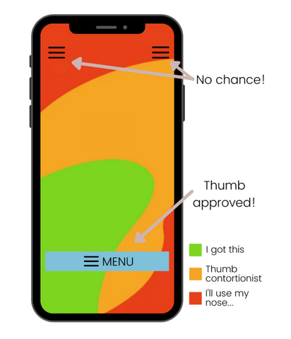
We found this diagram which shows just what the typical adult hand can reach on an iphone 6 (this isn’t even a petite women’s smaller than average hand!)

The different shading shows how difficult it is to reach that area, green is natural, orange is a real stretch and red might as well be the top shelf of the cupboard without a chair to stand on!
We put our menu on the bit you can actually reach, it looks abit odd - took us a bit to get used to - but its certainly easier to use.
This was a very long way of saying we really do think hard and question the status quo. Be it website navigation menu’s or petite clothing - we’ve got your consideration in mind.


Leave a comment